Getting Started
We're extremely happy you chose us to be your 3d configurator partner!
We know your time is valuable, so we'll keep this quick, in essence, the following steps are required to get you up and running
- Upload some 3d models
- Upload some 3d textures
- Create some materials
- Combine everything above into a configurator
- Publish the configurator on your website
Read some more in the following paragraphs for more info
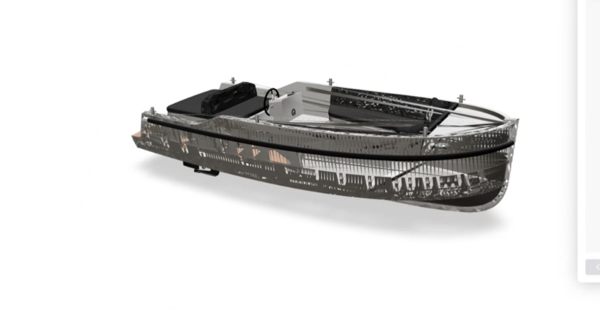
Uploading 3d models
It all starts here
There can be no such thing as a 3d product configurator without 3d models. As such, the whole process starts by uploading 3d models. The 3d models can be made in your favourite 3d modeling application. Below you can find some tips and tricks.
- Currently we only support .obj files
- You must make an export for each part of the model that has a different material
- Export all objects in relation to the same origin point
- Scaling the whole scene and positioning the camera can be done in a later step
Uploading Textures
Want to have some shiny wood materials?
Some materials can't be defined by just simple colors. We've included the ability to upload your own textures.
- Make sure you are licenced to use the textures (ie. they are yours)
- Upload a minimum resolution of 2000px on the biggest side. We dynamically resize the images for different devices
Creating Materials
Shiny Chrome? Or Black Plastic? You pick!
This is the last step before making the actual configurator. Models with applied materials make for beautifully rendered scenes.
If you want to test every material, it's helpfull to start off with a simple base material, go to step 4 and then come back here to assign materials model by model Remember that every single texture you add to the material will have to be downloaded by the end user. That user may very well be in the train on an extremely slow connection There are a big amount of options in the material editor. Here are some of the important ones
- Color - This determines the color of your model. Please not that the environment with the reflection will affect this, so it's often better to eyeball this than to use the exact hexadecimal value
- Map - In case you have a texture in mind for the color of your material, this is where you would add it. The color is multiplied on top which means you can create several variations of the same material without having the user have to re-download the texture again.
- Roughness - This determines how sharp the material reflects its environment. The higher the roughness, the more blurry the reflection (note that you can also use a map here)
- Metalness - This determines (more or less) the contrast of the reflections. Higher values have a more contrasty reflection (and are more metal-like) than low values (note that you can also use a map here)
- Opacity - This determines the opacity of the model. With some models there may be some ever so slight glitches, we're working on those
- Bump / Normal - You can opt to use either bump or normal mapping. When choosing, we recommend opting for normal maps as they will give a better result in the end. Especially reflective materials tend to come out rather harshe when using bump mapping
There are many more options here and we encourage you to try them out. However, with the options above you can get really far already!
Combine everything into a configurator
This is where the magic happens
Seeing everything come together is the best bit. You've uploaded your models, created some beautiful materials with amazing textures, you're on the home stretch now. Assembling a configurator uses the following steps. We recommend doing them sequentially.
- Define Structure - This is where you assemble your scene. Put everything in there, including all the optional components. Structure them in such a way that you know which ones can be swapped out for others.
- Define Options - Want to add an option to change materials? Or to change models? This is where you do that. Add an option from the sidebar, and choose which objects or groups are affected. Note that swapping out groups with single objects doesn't work. If you would like to do that it's best you put the single object in a group too.
- Add Steps - Defining the options and adding them to different steps has been split out so you can add multiple options to a single step. We would recommend going from the biggest changes to the smallest changes in the order of the steps
- Properties - These can be done at anytime. Here are the options to change the scale of the scene and the position of the camera. We're working on a special mode where you can see the x / y / z positions of the camera and target so you can easily enter them into the properties
Environments
In this article, we will focus on environments, which are high dynamic range (HDR) images that can be used to light up the 3D scene in your product configurator.
What are HDR images and why would you use them?
HDR images are a type of image file that captures a wider range of luminance values than a standard image. This means that they can represent a greater range of light and dark areas in a scene, and can more accurately reproduce the full range of colors and details that the human eye can see. As a result, HDR images can provide a more realistic and immersive experience for the user of a product configurator.
There are many situations where using an HDR image as an environment in Konfig can be beneficial. For example, if you want to create a realistic representation of a product in a specific location, such as a kitchen or a living room, using an HDR image of that location can help to create a more accurate and believable scene. Additionally, if you want to simulate different lighting conditions, such as daylight, sunset, or night, using an HDR image can allow you to create those conditions more realistically.
How to use environments in Konfig
Using an HDR image as an environment in Konfig is a simple process. First, you will need to upload the HDR image to Konfig by going to the "Environments" tab in the menu and clicking the "Upload" button. This will open a file browser, where you can select the HDR image you want to use. Konfig supports .hdr file formats.
Once you have uploaded the HDR image, you can use it as an environment in your product configurator by going to the "Settings" tab a Konfig and enabling the environment. You can also adjust the camera's exposure to create the desired lighting effect.
It's important to note that using an environment in Konfig will increase the size of the configurator, as the HDR image will need to be downloaded by the user. This can affect the performance of the configurator, especially on slower internet connections. As a result, you should use environments sparingly and only when they are necessary to create the desired effect.
Concluding
HDR images can be a valuable tool for creating realistic and immersive product configurators with Konfig. By uploading an HDR image as an environment, you can add a level of realism and detail to your 3D scene that would be difficult to achieve with other methods. While using environments can increase the size of the configurator, they can provide significant benefits in terms of visual quality and user experience.
Preview Images
In this article, we will focus on preview images, which can be used to provide a visual representation of options in the product configurator.
What are preview images and why would you use them?
Preview images are images that can be used to represent options in a product configurator. Instead of displaying options as plain text, preview images allow users to see a visual representation of the option before making a selection. This can make the product configurator more intuitive and user-friendly, and can help users to make more informed decisions about their product configuration.
There are many situations where using preview images can be beneficial in Konfig. For example, if you are offering a range of materials, colors, or finishes for a product, using preview images can help users to see what the different options look like and make a more informed choice. Additionally, if you are offering a range of accessories or additional components for a product, using preview images can help users to see how the different options would fit with the main product.
How to use preview images in Konfig
Using preview images in Konfig is a simple process. First, you will need to upload the preview images to Konfig by going to the "Options" tab in the header and clicking the "Add" button. This will open a file browser, where you can select the preview images you want to use. Konfig supports .jpg, .png, and .gif file formats.
Once you have uploaded the preview images, you can use them to represent options in your product configurator. To do this, go to the "Options" tab in the Konfig and enable the preview images.
Material Specific
If you simply enable preview images without uploading / picking a specific one, Konfig will automatically add the preview image of the material
Meshes
In this article, we will focus on meshes, which are the 3D models that make up the product configurator.
What are meshes and how do they work in Konfig?
A mesh is a collection of vertices, edges, and faces that define the shape of a 3D object. In Konfig, meshes are used to create the 3D models of the products that can be configured by the user. Konfig supports .obj file formats for meshes, which are a widely used and well-supported format for 3D models.
How to use meshes in Konfig
In order to use meshes in Konfig, you will need to export them from your 3D modeling application. When exporting meshes for Konfig, there are a few important things to keep in mind:
- Each object that can be configured and has its own material must be exported separately. For example, if you have a chair with a wood frame and a fabric seat, you would need to export the frame and the seat as separate objects.
- Each object must be exported relative to the same origin point. This is because Konfig does not currently support repositioning objects within the configurator, so it is important to make sure they are positioned correctly in the 3D modeling application before exporting.
- Make sure to include any UV coordinates and normals in the exported file. These are used by Konfig to apply materials and lighting to the mesh, and are necessary for the configurator to
After exporting them, you can upload them in the "Meshes" tab
Textures
In this article, we will focus on textures, which are images that can be applied to 3D models to add detail and realism to the product configurator.
What are textures and how do they work in Konfig?
A texture is an image that can be applied to a 3D model to add detail and realism to the model. Textures can be used to simulate a wide range of materials, such as wood, metal, fabric, or stone, and can be used to create a wide range of visual effects. In Konfig, textures are applied to 3D models using materials, which define the properties of the texture and how it should be applied to the model.
In order to use textures in Konfig, you will need to upload them to the system. Konfig supports a .jpg file format for textures, and automatically resizes the images to fit into three different sizes: 256, 512, and 1024 pixels at the widest edge. These different sizes are used by Konfig to optimize the performance of the configurator, based on the user's internet connection.
When uploading textures to Konfig, there are a few important things to keep in mind:
- Make sure you have the rights to use the textures. Konfig does not allow the use of copyrighted or trademarked textures without permission.
- Aim for a minimum resolution of 2000px on the biggest side. This will ensure that the texture looks good on high-resolution displays, and will also give Konfig enough information to resize the texture for different screen sizes and internet speeds.
- Keep the number of textures used in the configurator to a minimum. Every texture that is used in the configurator will need to be downloaded by the user, which can affect the performance of the configurator, especially on slower internet connections.
How to use textures in Konfig
Once you have uploaded your textures to Konfig, you can apply them to 3D models using materials. This process is covered in more detail in the documentation on materials. By using textures in combination with materials, you can create a wide range of visual effects and simulate a wide range of materials in your product configurator.
Materials
The Konfig content management system allows users to create custom product configurations using 3D models, materials, textures, and environments. In this article, we will focus on the material editor, which is a tool that allows users to create and customize materials for use in the product configurator.
What is the material editor and how does it work in Konfig?
The material editor is a tool that allows users to create and customize materials for use in the product configurator. A material defines the appearance of a 3D model, including its color, texture, roughness, metalness, opacity, and other properties. Using the material editor, users can create a wide range of materials, from simple solid colors to complex, multi-layered materials with multiple textures and properties.
In order to use the material editor in Konfig, you will need to create a new material by clicking the "Create" button in the "Materials" tab. This will open the material editor, where you can adjust the various properties of the material. The material editor provides a wide range of options, including the following:
- Color: This determines the color of the material. You can either enter a hexadecimal color value or use the color picker to select a color.
- Map: If you want to use a texture to define the color of the material, you can use the map option to specify the texture. The texture will be multiplied on top of the base color, allowing you to create variations of the same material without having to re-download the texture.
- Bump Map: This allows you to use a texture to create the illusion of bumps or dents on the surface of the material.
- Bump Scale: This controls the strength of the bump map, allowing you to adjust the level of detail in the bumps or dents.
- Clearcoat: This adds a glossy layer on top of the material, simulating the effect of a clear coat of paint.
- Clearcoat Roughness: This controls the roughness of the clearcoat layer, allowing you to adjust how blurry or sharp the reflections are on the surface of the material.
- Reflectivity: This controls how much the material reflects its environment. A value of 1 means the material will reflect its environment perfectly, while a value of 0 means it will not reflect its environment at all.
- Roughness: This controls the roughness of the material, allowing you to adjust how blurry or sharp the reflections are on the surface of the material.
- Roughness Map: This allows you to use a texture to define the roughness of the material, allowing you to create fine-grained control over the appearance of the material.
- Metalness: This determines how metallic the material is. A value of 1 means the material is a perfect conductor of electricity, while a value of 0 means it is a perfect insulator.
- Opacity: This controls the transparency of the material. A value of 1 means the material is completely opaque, while a value of 0 means it is completely transparent.
- Normal Map: This allows you to use a texture to define the surface normals of the material, allowing you to create the illusion of bumps or dents on the surface without actually modifying the geometry of the model.
- Normal Scale X/Y: These control the strength of the normal map in the X and Y directions, allowing you to adjust the level of detail in the bumps or dents.
- AO Map: This allows you to use a texture to define the ambient occlusion of the material, simulating the effect of shadows in crevices and corners of the model.
- Alpha Map: This allows you to use a texture to define the transparency of the material. This can be used to create masks or cutouts on the surface of the material.
- AO Map Intensity: This controls the strength of the ambient occlusion map, allowing you to adjust the level of shadowing on the surface of the material.
- Displacement Map: This allows you to use a texture to displace the vertices of the model, creating the illusion of bumps or dents on the surface of the material.
- Displacement Scale: This controls the strength of the displacement map, allowing you to adjust the level of detail in the bumps or dents.
- Metalness Map: This allows you to use a texture to define the metalness of the material, allowing you to create fine-grained control over the appearance of the material.
- Light Map: This allows you to use a texture to define the lighting of the material, allowing you to simulate complex lighting effects on the surface of the material.
- Light Map Intensity: This controls the strength of the light map, allowing you to adjust the level of detail in the
- Light Map Intensity: This controls the strength of the light map, allowing you to adjust the level of detail in the lighting on the surface of the material.
- Emissive Map: This allows you to use a texture to define the emissive color of the material, allowing you to create the illusion of glowing or self-illuminated surfaces.
- Emissive Intensity: This controls the strength of the emissive map, allowing you to adjust the intensity of the glowing or self-illuminated effect on the surface of the material.
- Transmission: This controls how much light passes through the material. A value of 1 means the material is completely transparent, while a value of 0 means it is completely opaque.
- Repeat X/Y: These control the tiling of the textures on the surface of the material. A value of 1 means the texture will be repeated once in each direction, while a value of 2 means it will be repeated twice, and so on.
Introduction
In this article, we will focus on Konfigs, which are the final entities that combine all of these building blocks into a product configurator.
What is a Konfig and how does it work in Konfig?
A Konfig is a product configurator created using the Konfig content management system. It combines 3D models, materials, textures, and environments into an interactive application that allows users to customize and configure products.
In order to create a Konfig in Konfig, you will need to upload 3D models, textures, and environments, and create materials using the material editor. Once you have these building blocks, you can create a Konfig by following these steps:
- Define the structure of the Konfig by organizing the 3D models into a hierarchical structure. This includes adding objects and groups to the scene, and assigning meshes and materials to each object.
- Define the options that the user can change in the Konfig. This includes adding options to swap out objects or groups, change materials, or input numeric values.
- Group options into steps to make it easier for the user to understand and navigate the Konfig.
- Edit the settings for the Konfig, including pricing, environment, and camera settings.
Once you have created your Konfig, you can publish it on your website, allowing users to interact with it and configure products. The Konfig content management system provides a wide range of tools and options to help you create professional and engaging product configurators.
Structure
In this article, we will take a deep dive into the structure of a Konfig, and provide some tips on how to group objects in order to create effective options.
What is the structure of a Konfig?
The structure of a Konfig refers to the hierarchical organization of the 3D models that make up the product configurator. This includes the individual objects that make up the product, as well as any groups of objects that can be swapped out or customized by the user.
The structure of a Konfig is important for several reasons. First, it determines the visual appearance of the product and the options available to the user. Second, the structure of a Konfig is used to define the options that the user can change. For example, if a chair has multiple frames, you can create an option that allows the user to switch between different frames. In order to do this, the frames must be organized into a group in the structure of the Konfig. Third, the structure of a Konfig can affect the performance of the product configurator. If the Konfig has a large number of objects and groups, it may take longer to load and render, which can affect the user experience.
Tips for grouping objects in a Konfig
Here are some tips for grouping objects in a Konfig:
-
Group objects that can be swapped out or customized by the user. For example, if a chair has multiple frames, you can create a group for the frames and then create an option that allows the user to switch between the different frames.
-
Group objects that are related to each other and should be treated as a single unit. For example, if a chair has multiple components that are always used together (such as the seat, backrest, and legs), you can create a group for these components and treat them as a single unit in the Konfig.
-
Use clear and descriptive names for groups to make it easy for the user to understand the structure of the Konfig. For example, instead of using generic names like "Group 1" and "Group 2", you can use more descriptive names like "Frame Options" and "Seat Components".
-
Use logical and intuitive organization of groups to make it easy for you to navigate the Konfig. For example, you can organize groups in a way that reflects the real-world structure of the product.
By following these tips, you can create effective and user-friendly group structures in your Konfigs, which will improve the flexibility of your product configurators.
Options
In Konfig, options are used to define the customizable aspects of a product configurator. Options allow users to swap out objects, groups, materials, or input numeric values, which can be used to create a wide range of customizations and configurations. In this article, we will take a deep dive into Konfig options, and provide an overview of each of the option types.
Object options
Object options allow users to swap out one object for another in the Konfig. For example, if a chair has multiple seats, you can create an object option that allows the user to choose between different seats. Object options are defined using the structure of the Konfig.
To create an object option, you will need to:
- Identify the group of objects that you want to include in the option. This could be a group of frames for a chair, or a group of colors for a product.
- Create the option in the Konfig editor, clicking the "Object" option button
- Select the objects that you want to include in the option.
- Specify the default object that should be selected when the Konfig is first loaded.
- Preview the Konfig and test the option to ensure that it works as expected.
Group options
Group options allow users to swap out one group of objects for another in the Konfig. For example, if a chair has multiple frames, each with multiple components, you can create a group option that allows the user to choose between different frames. Group options are defined using the structure of the Konfig, and they require that the groups to be swapped out are nested within a parent group.
To create a group option, you will need to:
- Identify the parent group that contains the groups that you want to include in the option. This could be a group of frames for a chair, or a group of product variants for a product.
- Create the option in the Konfig editor, and select "Group" as the option type.
- Select the groups that you want to include in the option.
- Specify the default group that should be selected when the Konfig is first loaded.
- Preview the Konfig and test the option to ensure that it works as expected.
Material options
Material options allow users to swap out one material for another on an object in the Konfig. For example, if a chair has multiple frames, each with a different material, you can create a material option that allows the user to choose between different materials for the frames. Material options are defined using the materials that have been created in the Konfig, and they require that the objects to be modified have been assigned materials in the Konfig structure.
To create a material option, you will need to:
- Create the option in the Konfig editor, using the create "Material" button
- Identify the material that you want to modify with the material option.
- Add the other materials you want to be able to swap this out for in the "Settings" tab
- With the default material, you decide which objects have the potential to be affected by the change. In the "Affects" tab, you can filter all of them to the specific sub-set of objects you want to be affected by the chagne in material
- Preview the Konfig and test the option to ensure that it works as expected.
Number input options
Number input options allow users to input numeric values in the Konfig, which can be used for calculations or other purposes. For example, if a chair has customizable dimensions, you can create number input options that allow the user to specify the width, height, and depth of the chair. Number input options are defined using a simple input field, and they do not require any specific objects or groups in the Konfig structure. It is important to note that they can only be used in pricing calculations. They cannot affect anything in the scene itself.
To create a number input option, you will need to:
- Identify the purpose of the number input option, and how the input value will be used. This could be for calculations, such as determining the price of a product, or for other purposes, such as specifying a custom measurement.
- Create the option in the Konfig editor, using the "Number" create button
- Specify the name and label for the option, and specify the default value for the input field.
- Specify any additional settings for the option, such as the minimum and maximum values, the step size, and any formatting options.
- Preview the Konfig and test the option to ensure that it works as expected.
By using these option types, you can create a wide range of customizable options in your Konfigs, which will improve the flexibility and user experience of your product configurators.
Shared Options
Every option in a Konfig, except for the number input option, has the following options that can be configured:
- Name: The name of the option, which will be displayed to the user in the Konfig. This should be a clear and descriptive name that explains the purpose of the option.
- Category: The category of the option can be used to categorize multiple options for the User Interface, making it easier for a customer to make a decision - See below for details.
- SKU: The SKU (Stock Keeping Unit) of the option, which can be used for inventory and pricing management. This should be a unique identifier for the option, such as a product code or a serial number.
- Price: The price of the option, which can be either a fixed price or a price formula. The fixed price is a static value that will be used for all instances of the option, whereas the price formula is a dynamic calculation that can use the input values from number input options as inputs. The price formula supports basic arithmetic operations, such as addition, subtraction, multiplication, and division, as well as grouping and nesting of expressions.
Categorization
When defining an option on a Konfig, you can define a categorization by entering several categories into the options. Those categories will be merged and the Viewer will put the things in the correct place.
The displaying of categories is sorted. They are first sorted on the category name itself, and afterwards on the option name. Within the options, the sorting happens by first checking if there is a default option (that option will always be first), after which we start sorting by name. Sorting categories is in principle by name, but there is a way to sort them manually by prefixing them with a number and colon. When showing the title, we will hide the number and colon;
Option 01<- Sorted by Name, shown as is1. Option 01<- Sorted by the Number, shown like1. Option 01(there is no colon, so we don't remove it)1: Option 01<- Sorted by the Number, shown likeOption 01(the number is hidden)3453565: Option 01<- Sorted by the Number, shown likeOption 01(the number is hidden)Subcategory 01: Option 01<- Sorted by the elements on the left hand side of the:, shown likeOption 01(the number is hidden)
SKU's
In a Konfig, the SKU for a total product is comprised of multiple sub-SKUs, which correspond to the individual options that make up the product. For example, when defining the options in a Konfig, you can specify the SKU for each option, which will become a sub-SKU of the total product SKU. For example, if you define a frame option for a chair with the SKU "FRAME-001", this SKU will be included in the total product SKU as a sub-SKU. It is important to note that the SKU you define for an option in the Konfig is a sub-SKU, and not the SKU for the total product. When a user hits 'add-to-cart', we provide an object with the final configuration for you to handle the assembly of the SKU in whichever way you like.
By using sub-SKUs for the options in a Konfig, you can manage the inventory and pricing of the individual options, as well as the total product, in a flexible and scalable way. This will allow you to offer a wide range of customizable products to your users, while maintaining accurate and up-to-date inventory and pricing information.
Steps
In a Konfig, steps are used to group multiple options into logical and user-friendly units.
Each step in a Konfig can be composed of multiple options, and the options within a step can be ordered in any way that makes sense for the product. For example, you can order the options in a step by relevance, by importance, or by any other criteria that you choose.
In addition to the options, each step in a Konfig can also have a specific camera position, which will be used when the user selects the step in the Konfig. This allows you to create an immersive and engaging user experience, by showing the product from different angles and perspectives as the user navigates between the steps.
To create a step in a Konfig, you will need to:
- Identify the options that you want to include in the step, and group them together in a logical and user-friendly way. For example, you can group the options for a specific frame of a chair, or for a specific component of a product.
- Create the step in the Konfig editor, and specify a name for the step. This will be displayed to the user in the Konfig, and it should provide a clear and concise name of the options in the step.
- Add the options that you want to include in the step, and arrange them in the desired order. You can select options in the sidebar and move them to the step.
- Specify the camera position for the step, by adjusting the position and orientation of the camera in the Konfig preview. This will determine the view of the product that the user will see when they select the step in the Konfig.
- Preview the Konfig and test the step to ensure that it works as expected, and that the options and the camera position are displayed correctly.
By using steps in a Konfig, you can create a user-friendly and engaging product configurator, which will allow your users to easily customize and configure the products that you offer. By grouping the options into logical units, and by providing specific camera positions for each step, you can create a seamless and intuitive user experience, which will improve the overall effectiveness of your Konfigs.
Settings
Pricing
Enable and customize the pricing for the product being configured in Konfig. Options include turning pricing on or off, specifying the currency, rounding digits, setting a fixed price or using a price formula, and specifying the base SKU.
Custom Styles
Add custom cascading style sheets (CSS) to Konfig and customize the appearance of the product being configured. Can be inspected and modified using the Chrome inspector.
Translations
Add custom translations for labels and messages used in Konfig. Options include translating the "price" and "step" labels, the "add to cart" button, and default category names.
Environments
Customize the Environments of Konfig.
Cameras
Customize the camera of the Konfig.
Pricing
In the Konfig settings, there is a section on pricing, which allows you to configure the pricing and inventory management for the product that is being configured. The pricing settings in a Konfig include the following options:
- Turn pricing on or off: This option allows you to enable or disable the pricing for the Konfig.
- Currency: This option allows you to specify the currency that will be used for the prices in the Konfig.
- Rounding digits: This option allows you to specify how many digits the prices should be rounded to.
- Price: This will set a fixed base-price for the Konfig (not that you can use either this or the price formula)
- Price formula: This option allows you to specify a formula that will be used to calculate the prices for the options and the total product.
- Base SKU: This option allows you to specify the base SKU for the product that is being configured in the Konfig.
By using the pricing settings in a Konfig, you can enable, customize, and manage the pricing for the product that is being configured. These settings are used to calculate and display the prices in the Konfig, and they can be adjusted to reflect the specific requirements and constraints of the product and the target market.
Custom Styles
In the Konfig settings, there is a section on custom-css, which allows you to add custom cascading style sheets (CSS) to the Konfig, and to customize the appearance of the product that is being configured. The custom-css setting in a Konfig includes the following options:
When you enable the custom-css, the Konfig will use the default styles that are provided by the system, which include a bunch of borders around every single customizable element in the Konfig. You can then use the Google Chrome (or other browsers inspector) inspector in the browser to look up the elements in the Konfig, and to find the specific styles and rules that are applied to them. The Chrome inspector is a powerful tool that can be used to inspect the HTML and the CSS of the Konfig, and to see how the styles and the rules are applied to the elements in the Konfig. To use the Chrome inspector, you can open the Konfig in the Chrome browser, and then use the "Inspect" feature to open the inspector, and to navigate to the specific element that you want to inspect. Once you have selected the element, you can use the inspector to see the styles and the rules that are applied to the element, and you can use the inspector to modify and test the styles and the rules in real-time. By using the custom-css setting in a Konfig, you can add your own styles and rules to the Konfig, and you can customize the appearance of the product that is being configured. The custom-css setting allows you to use the Chrome inspector to inspect and modify the styles and the rules in the Konfig, and it allows you to create a unique and personalized experience for the end user of the Konfig.
Translations
In the Konfig settings, there is a section on translations, which allows you to add custom translations for the various labels and messages that are used in the Konfig. The translation settings in a Konfig include the following options:
- Price: This option allows you to specify the custom translation for the "price" label in the Konfig. The "price" label is used to display the price of the product that is being configured, and it can be translated into the language of your choice.
- Step: This option allows you to specify the custom translation for the "step" label in the Konfig. The "step" label is used to indicate the current step in the Konfig, and it can be translated into the language of your choice.
- Add to cart: This option allows you to specify the custom translation for the "add to cart" button in the Konfig. The "add to cart" button is used to add the product that is being configured to the shopping cart, and it can be translated into the language of your choice.
- Category name: This option allows you to specify the default name for the categories in the Konfig. The categories are used to group the options in the Konfig, and they can be used to create a more intuitive and user-friendly interface for the end user of the Konfig.
- Number input error messages: This option allows you to specify the custom translations for the error messages that are displayed in the number input in the Konfig. The number input is used to capture user input that can be used for pricing calculations, and it can display specific error messages when the user enters an invalid or out-of-range value. The error messages that can be translated include "The number is too small", "The number is too big", and "The user did not enter a valid number".
By using the translation settings in a Konfig, you can add custom translations for the various labels and messages that are used in the Konfig, and you can create a localized and user-friendly experience for the end user of the Konfig. The translation settings allow you to customize the labels and the messages in the Konfig, and they can be used to adapt the Konfig to the specific language and cultural requirements of the target market.
Environment
In the Konfig settings, there is a section on environments, which allows you to specify the lighting and the scale of the scene in the Konfig. The environment settings in a Konfig include the following options:
- Choose environment: This option allows you to select one of the uploaded environments that will be used as the lighting source for the Konfig. The environments are high-dynamic-range (HDR) images that can be used to light the scene in the Konfig, and they can provide realistic and high-quality reflections, shadows, and lighting for the product that is being configured.
- Additional ambient light: This option allows you to add additional ambient light to the Konfig, which can be used to lower the contrast of the final image. The ambient light is a constant light that illuminates the entire scene, and it can be used to soften the shadows and the highlights, and to create a more balanced and natural lighting for the product.
- Tonemapping exposure: This option allows you to change the exposure of the Konfig, which can be used to reduce or increase the overall brightness of the scene. The exposure is a global setting that affects the intensity of the light in the Konfig, and it can be used to create a more realistic and natural lighting, especially in scenes that are very bright or very dark.
- Scale-factor: This option allows you to set the scale-factor of the Konfig, which is a single number that scales the entire scene up or down to make it fit into the point-of-view of the camera. The scale-factor is a useful setting that can be used to compensate for the differences in the scale of the 3D models that are used in the Konfig, and it can be used to ensure that the product is displayed in a consistent and realistic manner.
By using the environment settings in a Konfig, you can specify the lighting and the scale of the scene in the Konfig, and you can create realistic and high-quality lighting for the product that is being configured. These settings can be used to control the appearance and the realism of the Konfig, and they can be adjusted to reflect the specific requirements and constraints of the product and the target market.
Camera
In the Konfig settings, there is a section on camera settings, which allows you to customize the behavior of the camera in the Konfig. The camera settings in a Konfig include the following options:
- Rotation: This option allows you to enable or disable the controls for rotating the camera in the Konfig. If the rotation controls are enabled, the end user of the Konfig can rotate the camera around the product that is being configured, and they can view the product from different angles and perspectives.
- Zooming: This option allows you to enable or disable the controls for zooming in and out on the camera in the Konfig. If the zooming controls are enabled, the end user of the Konfig can zoom in on the product that is being configured, and they can see the details of the product more clearly.
- Panning: This option allows you to enable or disable the controls for panning the camera in the Konfig. If the panning controls are enabled, the end user of the Konfig can pan the camera horizontally and vertically, and they can move the camera around the product that is being configured.
- Minimum distance: This option allows you to specify the minimum distance that the camera can be from the product that is being configured. The minimum distance can be used to ensure that the end user of the Konfig cannot zoom in too closely on the product, and it can prevent the camera from becoming obscured by the product.
- Maximum distance: This option allows you to specify the maximum distance that the camera can be from the product that is being configured. The maximum distance can be used to ensure that the end user of the Konfig cannot zoom out too far from the product, and it can prevent the camera from becoming too far away from the product.
- Default camera position: This option allows you to specify the default position of the camera in the Konfig. The default camera position can be used to set the initial view of the product that is being configured, and it can be used to create a consistent and user-friendly experience for the end user of the Konfig.
Note: The minimum and maximum distance settings for the camera can conflict with the default camera position, and this can result in a jumping camera. In order to avoid this problem, it is recommended to set the minimum and maximum distances in such a way that they are consistent with the default camera position.
By using the camera settings in a Konfig, you can customize the behavior of the camera in the Konfig, and you can create a more user-friendly and intuitive experience for the end user of the Konfig. The camera settings allow you to control the rotation, zooming, and panning of the camera in the Konfig, and they can be used to create a more engaging and interactive experience for the end user of the Konfig.
Embedding
Adding a konfig to a website is relatively simple via means of an iFrame. Simply embedding the iFrame renders the configurator. Handling communication between the configurator and your website is done via means of PostMessage. Below is a small snipped that should work out of the box. We'll go into the details afterwards.
<!DOCTYPE html>
<html>
  <head>
    <meta content="text/html;charset=utf-8" http-equiv="Content-Type" />
    <meta content="utf-8" http-equiv="encoding" />

    <style>
      iframe {
        width: 100vw;
        height: 50vh;
      }
      p#currentState {
        word-wrap: break-word;
      }
    </style>
  </head>
  <body>
    <div>
      <iframe
          id="konfig-iframe"
          src="http://localhost:3001/1c23264d-23c0-428a-9b9c-6afc3bf2a2d7"
          frameborder="0"
          ></iframe>
    </div>

    <div style="width:40%;display:inline-block;">
    <h1>Step</h1>
    <p>Step</p>
    <form id="step">
      <label>
        Step:
        <input type="number" />
      </label>
      <input type="submit" title="set step" />
    </form>
    </div>
    <div style="width:40%;display:inline-block;">
    <h1>Option</h1>
    <p>Set Option</p>
    <form id="option">
      <label>
        Step: <input type="number" />
      </label>
      <br />
      <label>
        Option ID: <input />
      </label>
      <br />
      <label>
        Replacement ID: <input />
      </label>
      <br />
      <input type="submit" title="update option" />
    </form>

    </div>

    <h1>Konfig</h1>
    <p>Konfig</p>
    <p id="konfig">None</p>

    <h1>State</h1>
    <p>Current State:</p>
    <p id="currentState">None</p>
    <form id="updateState">
      <label>
        Update:
        <input />
      </label>
      <input type="submit" title="update" />
    </form>

  </body>
  <script>
    (async function () {
      /* --- Helpers from Konfig --- */
      const frame = document.getElementById("konfig-iframe");
      const dispatch = (message) => frame.contentWindow.postMessage(message, "*");

      const handleMessage = async (event) => {
        if (!event || !Array.isArray(event.data)) return;
        const [action, data] = event.data;

        switch (action) {
          case "DataLoaded":
            return handleDataLoaded(data);
          case "AddToCart":
            return handleAddToCart(data);
          case "ConfigurationChanged":
            return handleConfigurationChanged(data);
          case "ModelsLoaded":
            return console.log("Models Loaded In: ", data)
          case "Screenshot":
            return handleScreenshotTaken(data);
          default:
            console.log(action);
            console.warn("Action not supported");
        }
      };

      window.addEventListener("message", handleMessage, false);

      /* --- Messages that can be send back to Konfig --- */
      const messages = {
        addToCartSuccess: () => dispatch(["AddToCartSuccess"]),
        addToCartSuccessRedirecting: () =>
          dispatch(["AddToCartSuccessRedirecting"]),
        addToCartError: (e) => dispatch(["AddToCartError", e]),
        applyConfiguration: (e) => dispatch(["ApplyConfiguration", e]),
        setStep: (stepNo) => dispatch(["SetStep", stepNo]),
        activatePreset: (stepNo, presetId) => dispatch(["ActivatePreset", stepNo, presetId]),
        activateOption: (stepNo, optionId, replacementId) => dispatch(["ActivateOption", stepNo, optionId, replacementId]),
        updateNumberOption: (stepNo, optionId, no) => dispatch(["UpdateNumberOption", stepNo, optionId, no]),
        requestScreenshot: (id) => dispatch(["RequestScreenshot", id]),
      };

      /* --- Implement these --- */
      function handleDataLoaded(data) {
        const current = document.getElementById("konfig");
        current.innerText = JSON.stringify(data, null, 2);
        console.log(data);
      }

      function handleAddToCart(data) {
        try {
          console.log(data);
          messages.addToCartSuccess();
        } catch (e) {
          console.warn("Add to Cart Error", e);
          messages.addToCartError(e);
        }
      }

      function handleConfigurationChanged(data) {
        try {
          const current = document.getElementById("currentState");
          current.innerText = data;
        } catch (e) {
          console.warn("Handle Configuration Changed Error", e);
        }
      }

      const form = document.getElementById("updateState");
      form.onsubmit = (e) => {
        e.preventDefault();
        messages.applyConfiguration(e.target[0].value);
      };

      const form02 = document.getElementById("step");
      form02.onsubmit = (e) => {
        e.preventDefault();
        messages.setStep(Number(e.target[0].value));
      };

      const form03 = document.getElementById("option");
      form03.onsubmit = (e) => {
        e.preventDefault();
        let stepNo = Number(e.target[0].value);
        let optionId = e.target[1].value;
        let replacementId = e.target[2].value;
        messages.activateOption(stepNo, optionId, replacementId);
      };

      let latestId = "0";
      const screenshotButton = document.getElementById("screenshotButton");
      screenshotButton.addEventListener("click", () => {
        latestId = Date.now().toString();
        messages.requestScreenshot(latestId);
        console.log("screenshot")
      })

      const screenshotImage = document.getElementById("screenshotImage");
      function handleScreenshotTaken(data) {
        console.log(data)
        const [id, image] = data;
        if (id === latestId) {
           screenshotImage.src = image;
        }
      }
    })();
  </script>
</html>
iFrame
<iframe id="konfig-iframe" src="link-to-your-konfig" frameborder="0"></iframe>
The following snipped is used to actually embed a konfig. You are free to edit
everything, but whenever updating the id, it should be updated in the
<script /> tag as well.
Helpers
/* --- Helpers from Konfig --- */
const frame = document.getElementById("konfig-iframe");
const dispatch = (message) => frame.contentWindow.postMessage(message, "*");

const handleMessage = async (event) => {
  if (!event || !Array.isArray(event.data)) return;
  const [action, data] = event.data;

  switch (action) {
    switch (action) {
      case "DataLoaded":
        return handleDataLoaded(data);
      case "AddToCart":
        return handleAddToCart(data);
      case "ConfigurationChanged":
        return handleConfigurationChanged(data);
      case "ModelsLoaded":
        return handleModelsLoaded(data);
      default:
        console.log(action);
        console.warn("Action not supported");
  }
};

window.addEventListener("message", handleMessage, false);
Our helpers are simply a bit of boilerplate that we set-up to make sure we can
communicate with the configurator. The frame variable holds a reference to the
iFrame, such that we can send messages to said iFrame. dispatch is a function
that sends an actual message. handleMessage is where things get a bit more
interesting. We use ReasonML in our Frontends,
and we're able to send a typed message. As such, we know exactly which messages
our configurator can send. Currently, there are two. We'll get into some more details
in the next section.
Finally, we setup a listener that actually listens for events coming from the
configurator.
Messages
/* --- Messages that can be send back to Konfig --- */
const messages = {
  /* addToCartSuccess hides the loader */
  addToCartSuccess: () => dispatch(["AddToCartSuccess"]),
  /* addToCartSuccessRedirecting changes the loading message to show 'redirecting' */
  addToCartSuccessRedirecting: () => dispatch(["AddToCartSuccessRedirecting"]),
  /* addToCartError hides the loader - error handling will be implemented later */
  addToCartError: (e) => dispatch(["AddToCartError", e]),
  /* Takes one of the configuration outputs from the 'ConfigurationChanged' events and applies it */
  applyConfiguration: (e) => dispatch(["ApplyConfiguration", e]),
  /* Takes a number, and updates the step -- Steps start at 0 */
  setStep: (stepNo) => dispatch(["SetStep", stepNo]),
  /* Activates a Preset */
  activatePreset: (stepNo, presetId) => dispatch(["ActivatePreset", stepNo, presetId]),
  /* Activates an option */
  activateOption: (stepNo, optionId, replacementId) => dispatch(["ActivateOption", stepNo, optionId, replacementId]),
  /* Updates an option that holds a number */
  updateNumberOption: (stepNo, optionId, no) => dispatch(["UpdateNumberOption", stepNo, optionId, no]),
  /* Requests a screenshot. The ID is a string and is propagated to the response, such that multiple screenshots can be requested and matched. */
  requestScreenshot: (id) => dispatch(["RequestScreenshot", id]),
};
Next to knowing which messages the Viewer can send, we also know which messages it can receive. To make sure there are no typo's there from your side, we add them to an object lookup.
Implementation
  /* --- Implement these --- */
  function handleDataLoaded(data) {
    const current = document.getElementById("konfig");
    current.innerText = JSON.stringify(data, null, 2);
    console.log(data);
  }

  function handleModelsLoaded(data) {
    console.log(data);
  }

  function handleAddToCart(data) {
    try {
      console.log(data);
      messages.addToCartSuccess();
    } catch (e) {
      console.warn("Add to Cart Error", e);
      messages.addToCartError(e);
    }
  }

  function handleConfigurationChanged(data) {
    try {
      const current = document.getElementById("currentState");
      current.innerText = data;
    } catch (e) {
      console.warn("Handle Configuration Changed Error", e);
    }
  }

  const form = document.getElementById("updateState");
  form.onsubmit = (e) => {
    e.preventDefault();
    messages.applyConfiguration(e.target[0].value);
  };

  const form02 = document.getElementById("step");
  form02.onsubmit = (e) => {
    e.preventDefault();
    messages.setStep(Number(e.target[0].value));
  };

  const form03 = document.getElementById("option");
  form03.onsubmit = (e) => {
    e.preventDefault();
    let stepNo = Number(e.target[0].value);
    let optionId = e.target[1].value;
    let replacementId = e.target[2].value;
    messages.activateOption(stepNo, optionId, replacementId);
  };

  let latestId = "0";
  const screenshotButton = document.getElementById("screenshotButton");
  screenshotButton.addEventListener("click", () => {
    latestId = Date.now().toString();
    messages.requestScreenshot(latestId);
    console.log("screenshot")
  })

  const screenshotImage = document.getElementById("screenshotImage");
  function handleScreenshotTaken(data) {
    console.log(data)
    const [id, image] = data;
    if (id === latestId) {
       screenshotImage.src = image;
    }
  }
On Configuration Loaded
To make use of this, use the handleDataLoaded function.
On Underlying 3d Models Loaded
To make use of this, use the handleModelsLoaded function. The data here is
the loadtime in millisecond.
Add To Cart
To make use of this, use the handleAddToCart function. The data that is sent
a long looks like this:
type optionData = {
  name: string,
  additionalPrice: Number | null,
  sku: string | null,
  screenshot: string | null, /* Image data as png base64EncodedString */
  optionType: "MATERIAL" | "GROUP" | "OBJECT" | "NUMBER",
  value: string // In case optionType is Number, this semantically means "number"
};

type stepData = {
  name: string,
  screenshot: string | null, /* Image data as png base64EncodedString */
  options: [optionData],
};

type addToCartData = {
  name: string,
  currencySymbol: string | null,
  currencyCode: string | null,
  price: number | null,
  steps: [stepData],
  screenshot: string | null, /* Image data as png base64EncodedString */
  state: string /* Encoded format for the current configuration, to be passed back in 'ApplyConfiguration' */
};
Configuration Changed
The configuration can be programmatically changed from the outside using the 'applyConfiguration' event. Input for that can be taken either from the 'ConfigurationChanged' event, or from the state in the addToCartData object. It is a base64 encoded string representing our internal representation.
Forms
There are three forms in this example. The first form updates the state of the application. You can take the changed configuration string, and push that into the configurator. The second (#form02) takes a number, and pushes it into the setStep. It's important to note that HTML input elements output a string, regarless of their type.
(#form03) takes the stepNo, optionId and replacementId, and activates an option.
stepNo-> This is the index of the step the option resides inoptionId-> This the the ID of the optionreplacementId-> This the the exact replacement you want to activate. NOTE - this is NOT thereplacementDetailsId. FindreplacementIdto see all of them.
The screenshot button requests a screenshot and subsequently, there is some code that handles the response. The requestId has to be given, and is subsequently propagated back through the screenShotTaken event.
Known Issues
Introduction
This page, and it's subpages are used to track ongoing issues that we know of, that may or may not be in control, but we want to update our users on.
List
- Chromium Bug 1301748 - open
Chromium Bug 1301748
Issue Summary
We've found a known issue when using Google Chrome, on Intel Based Apple Macs, with AMD GPU's, on MacOS 11.6.4 and later, where rendering elements that have more than 64k triangles results in artifacts. This is due to a known technical glitch in Chrome, and some other browsers built similarly to Chrome. Oddly enough, this glitch doesn't go away easily - it sticks around even if you restart your browser or your computer.
It's linked to a particular process in Chrome named the "passthrough command decoder". This decoder is a part of the browser that's supposed to handle 3D models. But, in this case, it seems to be struggling with models that have a high number of triangles.
Maintainers of Google Chrome (/Chromium) are aware of this issue and are hard at work trying to fix it. They're focusing on tweaking a certain aspect of Chrome that might resolve the problem. Unfortunately, as of July 2023, this solution isn't ready to be rolled out yet.
Unfortunately - as Konfig, this issue is kind of out of our hands. We'll keep updating this article as the situation develops.
Scope
This bug affects the following 'venn diagram'
- Intel Based Macs
- With AMD GPUs (ie - the 'Pro' line-up)
- Running MacOS 11.6.4 or later
- Running a Chromium Based Browser (Chrome, Arc, Edge, etc.)
- Configurators that have elements that have more than 64k elements
Workarounds
- The main workaround here is to only upload elements that are limited to 64k triangles.
Technical Summary
Issue 1301748 is a technical problem in which 3D models with over 64,000 triangles are rendered with errors in Chromium based browsers. This bug is encountered specifically on Chrome versions 98.0.4758.109 and later, running on OS X Mac OS 11.6.4 and later. It does not affect other browsers that don't run a chromium source like Safari or Firefox.
The issue is stateful and can persist even after closing the Chrome/Chromium browser or rebooting the system. The bug is mainly detected when the triangles in the 3D models are connected to the wrong vertices, leading to a flawed rendering of the 3D mesh surface. This issue affects certain AMD GPUs on macOS and has been discovered to be specific to Chrome's use of a "passthrough command decoder".
The issue was reported in February 2022 and has since been tested and replicated. Workarounds have been proposed that involve using different command decoder options, and the problem has been categorized under the Blink>WebGL component for further investigation.
As of July 2023, there's been substantial discourse around the problem, but a definitive solution within the stable version of Chrome is yet to be finalized. The Chrome team is pressing forward with the launch of the passthrough command decoder and is trying to expedite the shipment of ANGLE's Metal backend to fix this issue.
Further Reading:
Changelog
- 2023-07-28 - Initial Article Written